 Creating
Cartoons: Step-by-Step Part 2
The final version of this cartoon
appeared in GPReview in February, 2001. You can read more about the story
behind it here.
STEP 1: Roughing out
the concept
Creating
Cartoons: Step-by-Step Part 2
The final version of this cartoon
appeared in GPReview in February, 2001. You can read more about the story
behind it here.
STEP 1: Roughing out
the concept
 Here you can see where, on a scrap of
paper, I've decided on the cartoon's dynamics - a large, suited
character (based on England's famed upper-class, corporate fat cats)
delivering his ultimatum to John Howard, whose reactions are
important. He is on the right, because he can't possible react to
something that hasn't been said yet! So we need his reactions AFTER
the corporate bigwig has said what he needs to say. This is repeated
in the second half of the cartoon.
STEP 2: Defining the
text
Here you can see where, on a scrap of
paper, I've decided on the cartoon's dynamics - a large, suited
character (based on England's famed upper-class, corporate fat cats)
delivering his ultimatum to John Howard, whose reactions are
important. He is on the right, because he can't possible react to
something that hasn't been said yet! So we need his reactions AFTER
the corporate bigwig has said what he needs to say. This is repeated
in the second half of the cartoon.
STEP 2: Defining the
text
 Here, I've worked out where the
dialogue is to go. I've pencilled it in, so I can estimate the amount
of space I'll need when I ink it in later. You can see where I've
sacrificed the character's legs for the text, which is more
important. The second panel is vacant - to repeat the scene, I'll
trace just the basic elements of the first panel into the second
using a lightbox - there will be fundamental differences
(expressions, gestures, etc.) but the basic office set will be the
same... this trick helps with continuity.
STEP 3: Inking it
in
Here, I've worked out where the
dialogue is to go. I've pencilled it in, so I can estimate the amount
of space I'll need when I ink it in later. You can see where I've
sacrificed the character's legs for the text, which is more
important. The second panel is vacant - to repeat the scene, I'll
trace just the basic elements of the first panel into the second
using a lightbox - there will be fundamental differences
(expressions, gestures, etc.) but the basic office set will be the
same... this trick helps with continuity.
STEP 3: Inking it
in
 Here's the inked-in black and white
version of the cartoon. I've rubbed out the pencil work and used
correction fluid to remove any excessive elements - it is very, very
easy to "overdraw" a cartoon. It's important to keep it relatively
simple so the reader doesn't get distracted from the message. I have
a fairly elaborate style of drawing and it's easy to get carried
away, so I have to keep my overdrawing tendency in check! To create a
flow of emphasis, I've written the key words in bold as a little
experiment. Some people italicize, but I thought I'd try something
different. To make the text panels stand out a bit, I reduced the top
and bottom of the drawing area - while the drawing still fits the
dimensions required, it looks a little more dynamic.
STEP 4: Adding
colour
Here's the inked-in black and white
version of the cartoon. I've rubbed out the pencil work and used
correction fluid to remove any excessive elements - it is very, very
easy to "overdraw" a cartoon. It's important to keep it relatively
simple so the reader doesn't get distracted from the message. I have
a fairly elaborate style of drawing and it's easy to get carried
away, so I have to keep my overdrawing tendency in check! To create a
flow of emphasis, I've written the key words in bold as a little
experiment. Some people italicize, but I thought I'd try something
different. To make the text panels stand out a bit, I reduced the top
and bottom of the drawing area - while the drawing still fits the
dimensions required, it looks a little more dynamic.
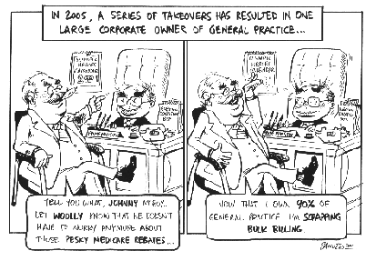
STEP 4: Adding
colour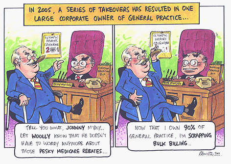 The finished cartoon! I use Pantone
markers to add my colour prior to scanning the cartoon and emailing
the cartoon to Melbourne. The markers blend together quite well and
are less fiddly than guache, which I also sometimes use. After I
apply the colour, I use the correction fluid to add little highlights
of light to the tips of noses, cheeks and glasses - basically,
anything with a shiny surface. Correction fluid is not necessarily
for mistakes - I also use it to sometimes separate a character from
the background... otherwise, for example, it might like a bookshelf
is coming out the side someone's head. I've always liked green walls
and purple carpet - don't ask me why!
Anyway - the client was happy and I got
paid. Another job well done!
Click here for an example of
creating art from a client's concept
The finished cartoon! I use Pantone
markers to add my colour prior to scanning the cartoon and emailing
the cartoon to Melbourne. The markers blend together quite well and
are less fiddly than guache, which I also sometimes use. After I
apply the colour, I use the correction fluid to add little highlights
of light to the tips of noses, cheeks and glasses - basically,
anything with a shiny surface. Correction fluid is not necessarily
for mistakes - I also use it to sometimes separate a character from
the background... otherwise, for example, it might like a bookshelf
is coming out the side someone's head. I've always liked green walls
and purple carpet - don't ask me why!
Anyway - the client was happy and I got
paid. Another job well done!
Click here for an example of
creating art from a client's concept

 Press the button to return to Steve's
Home Page
All artwork ©2003 Noz
Productions
Press the button to return to Steve's
Home Page
All artwork ©2003 Noz
Productions